From a hardware shop to a racing team. Same studio. Same craft.
A logo is the smallest thing a business owns and the one it uses most. We treat every brand-refresh project as if it'll outlive the website by ten years — because for most clients, it will. Below: five industries, five identities, all built from the same playbook.
Tim's Tools.
A neighborhood hardware shop that needed a mark with weight to it. The brief: read instantly at signage scale, sticker scale, and storefront-window scale — same character at every size.
We built a clean modern wordmark with a working tool-grip silhouette anchoring the lockup. Bold enough to print on a tee, quiet enough to engrave on a brass tag.
Amy's Yarn.
A yarn-and-fiber-arts identity that needed to feel handmade without feeling amateur — warm enough to live alongside textile photography, structured enough to hold up on a label or a hangtag.
We built a wordmark with a single hand-drawn loop that doubles as a stitch motif. It carries from window signage down to the smallest hangtag, and looks intentional both online and in-store.
Bryan Bros Construction.
A general-contractor identity that lives equally on a truck door, a yard sign, a hard hat, and a job-site dust mask. The mark had to read at every distance a job site demands.
The geometry is borrowed from framing-square corners — a callout to the trade itself, not a generic builder cliché. Holds up at three feet and at three hundred.
Venom Racing.
A racing identity strong enough to wrap a car, decal a trailer, sit on a fire suit, and still read on a $1 sticker. Aggressive without being cartoonish — most racing logos lean one way or the other; we wanted both.
Built a custom display letterform with an embedded fang motif inside the V. Reads as a wordmark from the stands and as a mark on a hood from the pit lane.
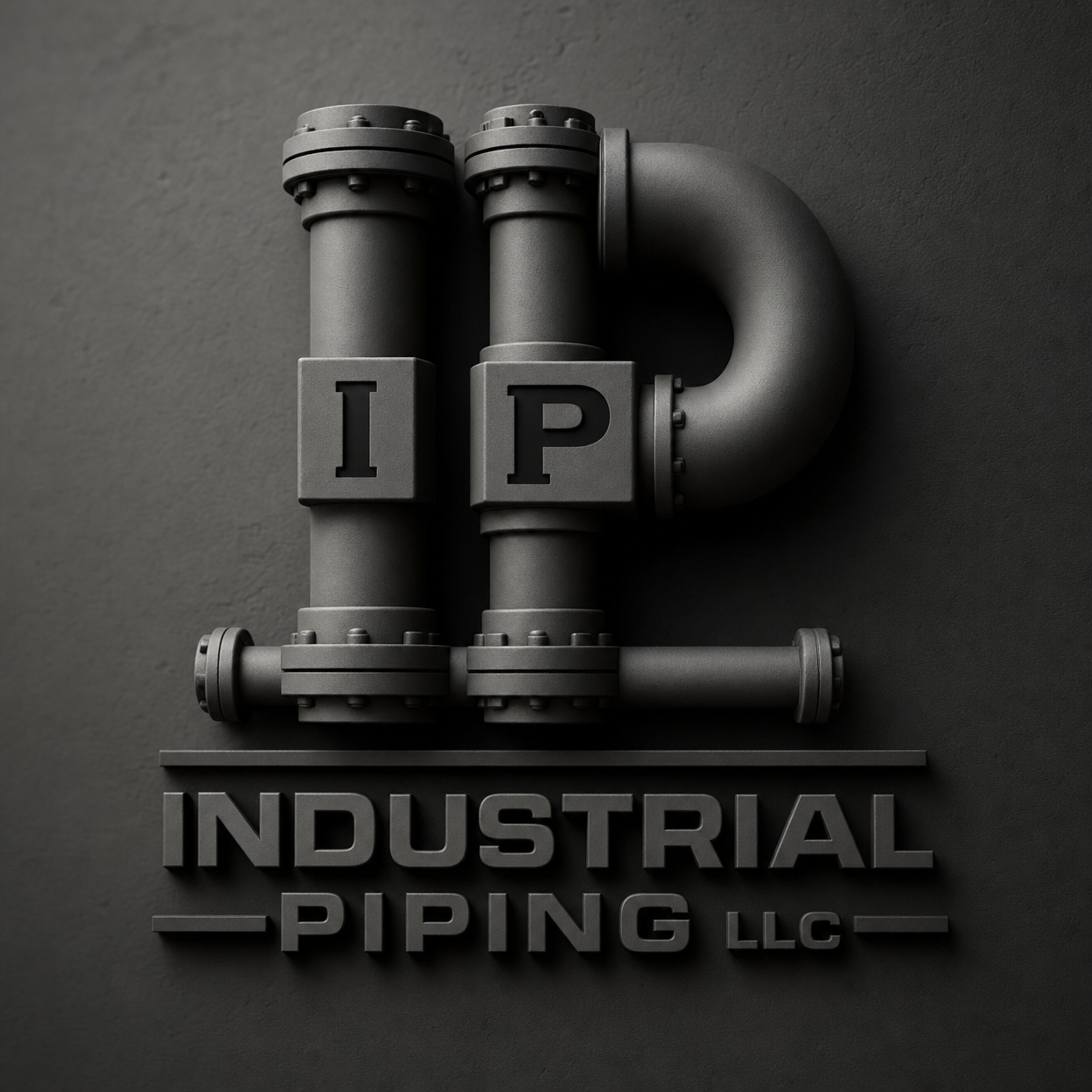
Industrial Piping LLC.
An industrial pipe-fab and field-welding identity built to survive at any scale, any surface, any lighting — truck doors, uniform patches, etched stainless, and dirty work surfaces all included.
The mark itself is a stylized pipe-section seen end-on — an obvious nod that doesn't read as cartoon. The wordmark is set in an industrial sans with the spacing dialed for laser-etching onto stainless plates.